I had just 10 minutes to explain the project that I had been working on for a year; and do it in a way that was interesting and made sense. To start, I created what I thought was a strong presentation for an audience unfamiliar with my work.
What I did right
I asked for feedback. The smartest move I made was asking colleagues to review and critique my presentation. What made sense to them? What didn’t? Their honest feedback helped me tighten and clarify my delivery.
I labeled charts like a pro! Here’s what worked in one of my charts:
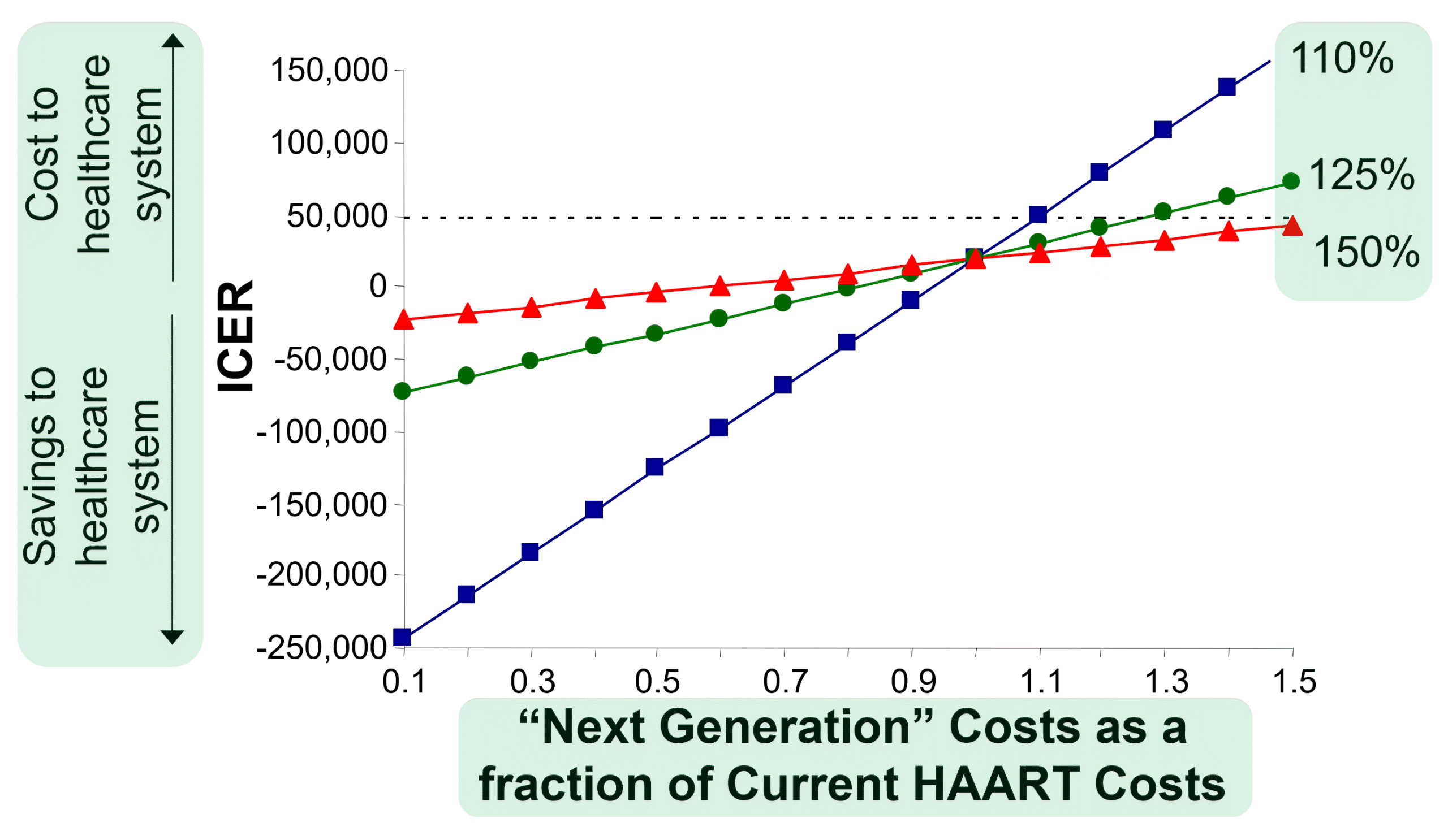
- I added interpretation arrows to the y (left)-axis, so people would know immediately how to read the results.
- I used an informative x (bottom)-axis label. Instead of jargon like “cost ratio,” I wrote out what the data actually meant.
- I placed data labels directly on the lines rather than in a distant legend. This is a design feature known as “minimizing eye movements,” making it easier for readers to connect the data key to the data themselves.
I introduced one concept at a time using PowerPoint’s animation feature. To explain my methods, I used a tree-like illustration. I started with showing the “trunk”, then adding a few “branches”, and finally the “leaves”. This step-by-step reveal helped the audience focus on each part as I explained it, making the presentation easier to follow.
What I did wrong
I used generic headers. Back then, I thought I was supposed to label presentation slides in the same nondescript way everyone else did. I used titles like “Study Objective” instead of “To evaluate the economic costs of more durable and effective treatment” and “Survival Years” rather than “Distribution of survival years after start of treatment.”
This wasted what I now call a slide’s “prime real estate” where I could have highlighted the key takeaway instead.
I included way too many decimals and confidence intervals. 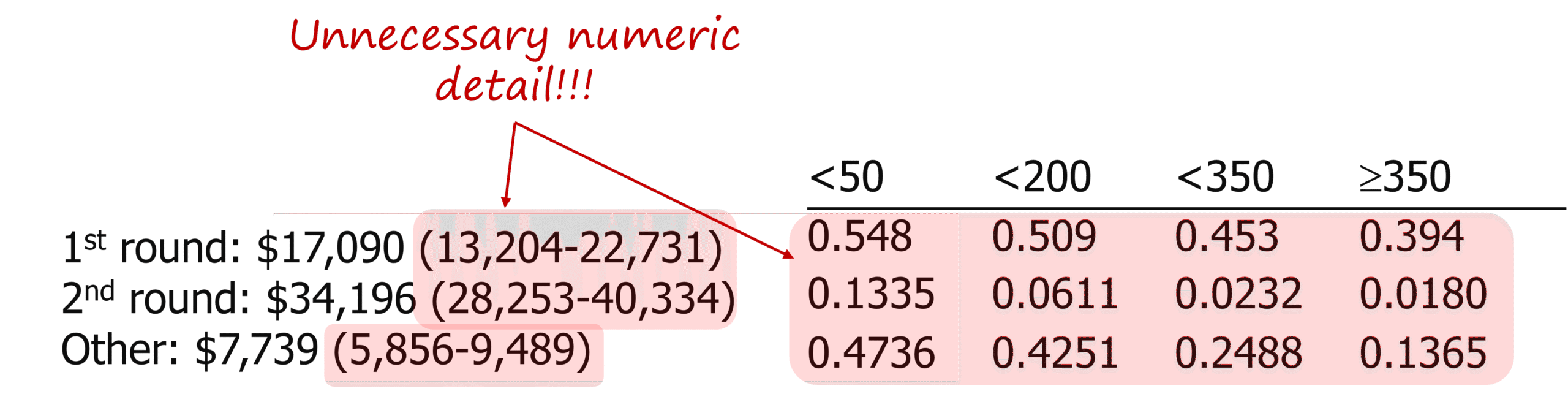
Were four decimal points necessary? Absolutely not. There is no reason anyone viewing a presentation on a screen needs that level of detail. I mistakenly thought what would be appropriate in a scientific manuscript would be appropriate for a scientific presentation. I was so wrong.
Lessons learned
- Feedback from experts sharpened my talk.
- Some commonsense design choices helped the audience understand my data better.
- Common habits of scientific presenters actually make presentations harder to understand.
Since that first talk, I’ve seen and delivered hundreds of presentations. I know what works and what doesn’t.
That’s why I developed the Presentation Power Hour to help scientists like you prepare talks that not only share your research but also build your reputation.
Most scientists are brilliant at conducting research but are never taught how to present it. I know because I’ve been there. It didn’t matter how great my research was if my audience didn’t get it, so I learned to cut the data clutter and focus on what really mattered.
The Presentation Power Hour ($150)
In one one-hour session, I’ll show you:
- How to sharpen your message
- How to simplify your slides
- What to do—and what to avoid.
- How to present with clarity, confidence, and credibility.
Email me to get started, and for a limited time, you’ll also get a free 30-minute follow-up session.
Click here for more info.
I can’t promise you’ll win awards, but I can promise you’ll be more confident to make the impression you want.