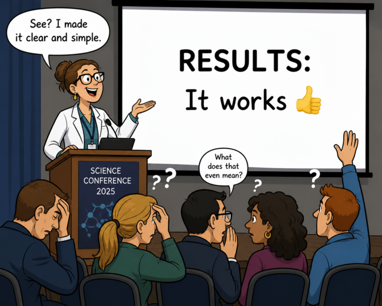
The most common pushback I hear when I talk about simplifying scientific communication is “How will people recognize my expertise if I don’t use scientific terms?”
On one level, that is a fair question. If “simplifying” means making it layperson-friendly, then of course you’d worry about losing credibility when presenting to a scientific audience.
But that’s not what I mean.
“Simplifying” doesn’t mean removing nuance or hiding complexity.
It means making your message easy for your audience to understand without unnecessary effort on their part.
Here are a few common ways scientists (often without realizing it) make their work harder to understand than it needs to be:
- Too many acronyms
- Overly wording phrasing that obscures the message
- Unstructured content that doesn’t guide the audience
- Text overload
In more technical terms, these practices increase cognitive load for listeners.
Your job is to reduce that. And it doesn’t necessarily require watering down any of your content. Let’s look at a couple of examples.
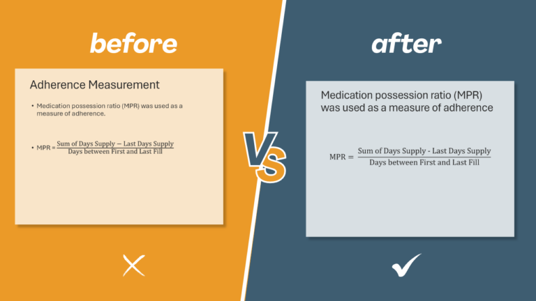
Example 1: Small change, big impact
In the “before” slide, the most prominent text is “Adherence Measurement.” But that’s not the most important information. It’s just a label.
The first bullet contains what the audience actually needs to know. So, in the “after” version, that information is the focal point.
This might seem like a trivial change. Surely people can figure out what matters, right? Yes, they can. But even small increases in cognitive load create subtle, negative reactions. And those reactions undermine your ability to inform, impress, or persuade.
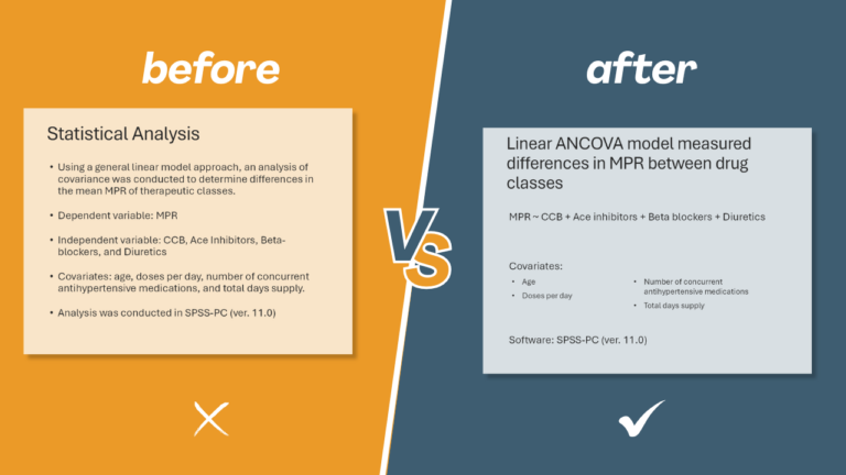
Example 2: Same content, clearer structure
Now let’s look at a more substantial revision. As in the first slide, the least informative text is the most prominent. But when you read it, the purpose of the slide is clear: It’s describing the specific statistical model the researchers used.
So the model should be the star of the slide. In the revised version, everything is organized around that idea, making it immediately clear what the audience is looking at.
A quick note on jargon and acronyms: You’ll notice I replaced analysis of covariance with ANCOVA. Conventional advice says don’t use acronyms without defining them.
To understand why, allow me to take a very unscientific poll. How many of you think analysis of covariance is more explanatory than ANCOVA?
Since I can’t see how you’re voting, I’m going to take an educated guess that you think they’re either equally explanatory or equally gibberish.
If you know what analysis of covariance is, then you already know the term ANCOVA. And if you don’t know what ANCOVA is, replacing it with analysis of covariance is about as explanatory as defining recursive by saying “See recursive.”
The same audience who understands analysis of covariance will also understand a simple pseudo-equation showing the model’s dependent and independent variables—without the need for extra words.
Next, I’ve used bullets for their intended purpose: lists. In a bit of presentation irony, the one part of the “before” slide that should have been a list, wasn’t!
That small formatting change makes the covariates much easier to scan at a glance, reducing cognitive effort.
The finishing touch: removing the unnecessary words introducing the software program.
Same data, different cognitive experience
I heard the phrase “same data, different cognitive experience” at a conference and nearly applauded. Because that’s the goal: You’re not changing your science; you’re changing how easy it is to understand.
And that’s part of your job.
Your job isn’t just to document your research. It’s to make it easy for your audience to understand it, so they can appreciate it—and appreciate you for doing it.
And to achieve that kind of clarity takes more thought than most researchers expect it will. But it’s worth it.